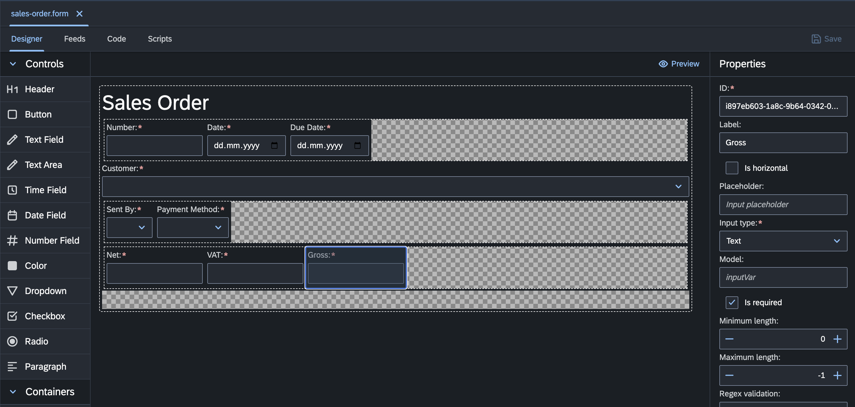
Form Designer
The codbex platform provides a powerful Form Designer tool that empowers users to create interactive and user-friendly input forms effortlessly. With a rich set of user interface widgets and intuitive design capabilities, the Form Designer simplifies the process of modeling and customizing input forms for various business applications.

Key Features
Visual Modeling: The Form Designer offers a visual interface for designing input forms, allowing users to drag and drop UI widgets onto the canvas and arrange them as needed. Users can easily add text fields, dropdown lists, checkboxes, radio buttons, date pickers, and other input controls to create customized forms tailored to their specific requirements.
Rich Set of Widgets: codbex platform provides a comprehensive library of UI widgets and components that users can use to build dynamic and interactive input forms. These widgets include standard form controls such as text inputs, buttons, labels, and containers, as well as advanced components like file uploaders, image galleries, rich text editors, and charting libraries. Users can choose from a variety of widgets to enhance the functionality and usability of their forms.
Customizable Templates: Form Designer offers customizable templates and themes that users can leverage to quickly create professional-looking input forms with consistent branding and styling. Users can choose from a selection of pre-designed templates or create their own custom templates to match their organization's branding guidelines and design preferences.
Data Binding and Validation: The Form Designer supports data binding and validation features, allowing users to bind form fields to data models and define validation rules to ensure data integrity and accuracy. Users can specify required fields, input formats, and validation constraints to enforce data validation rules and provide real-time feedback to users when input errors occur.
Responsive Design: Form Designer enables users to create responsive input forms that adapt seamlessly to different screen sizes and devices. Users can define layout configurations, breakpoints, and responsive behaviors to optimize the form's appearance and usability across desktops, tablets, and mobile devices.